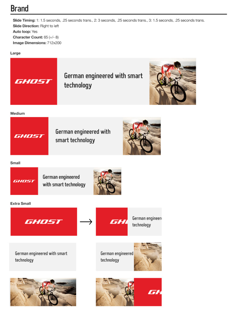
This was an exploration into how banner placements on the search results page for REI.com could be improved after the website redesign. When originally presented with the project, REI.com already had search banners but they weren’t responsive. After an initial period of research a set of banners types were classified such as product, sale, content and 6 others. As the designer I was tasked to create a template system in line with the new website structure and design standards. Through exploration I was to establish new standards such as character counts and image sizing.
The main challenge was height and how to fit a compelling message and visual story in space that didn’t bury the search results, especially when viewed on mobile devices. Due to current type stylings and padding universal to the site framework, the banners are not able to maintain their design as scaled down through the breakpoints, creating height concerns and a poor user experience. Clear pain points are choosing appropriate imagery as well as a very small character count for messaging. In the end, I created 4 basic templates as MVP (minimum viable product) that were deployable using the current website structure, with identifiable issues.
See full pdf with all templates and accompanying examples here.

Along with the above templates, I presented a series of possible solutions particularly looking at the extra small breakpoint. These would require further exploration and development of the website functionality.
See full pdf here.


